Luna de sal – Branding for a natural care line
Luna de Sal is a brand born from the desire to reconnect with what is essential: calm, the earth, the body. Its name blends the poetic with the tangible, evoking a moment of stillness, a daily ritual, a quiet beauty. The moon represents the cyclical, the intimate. The salt, the pure, the mineral, what endures.
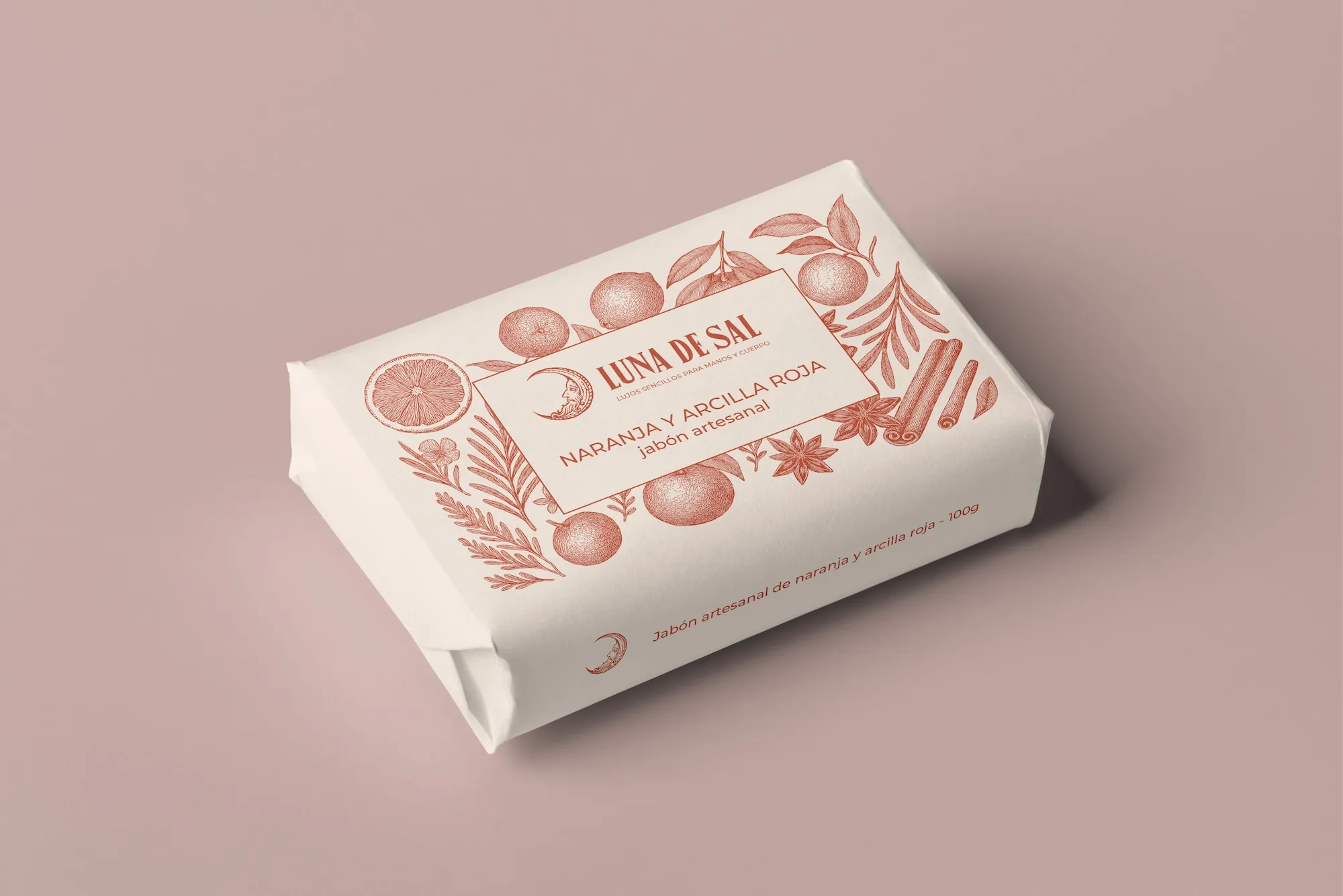
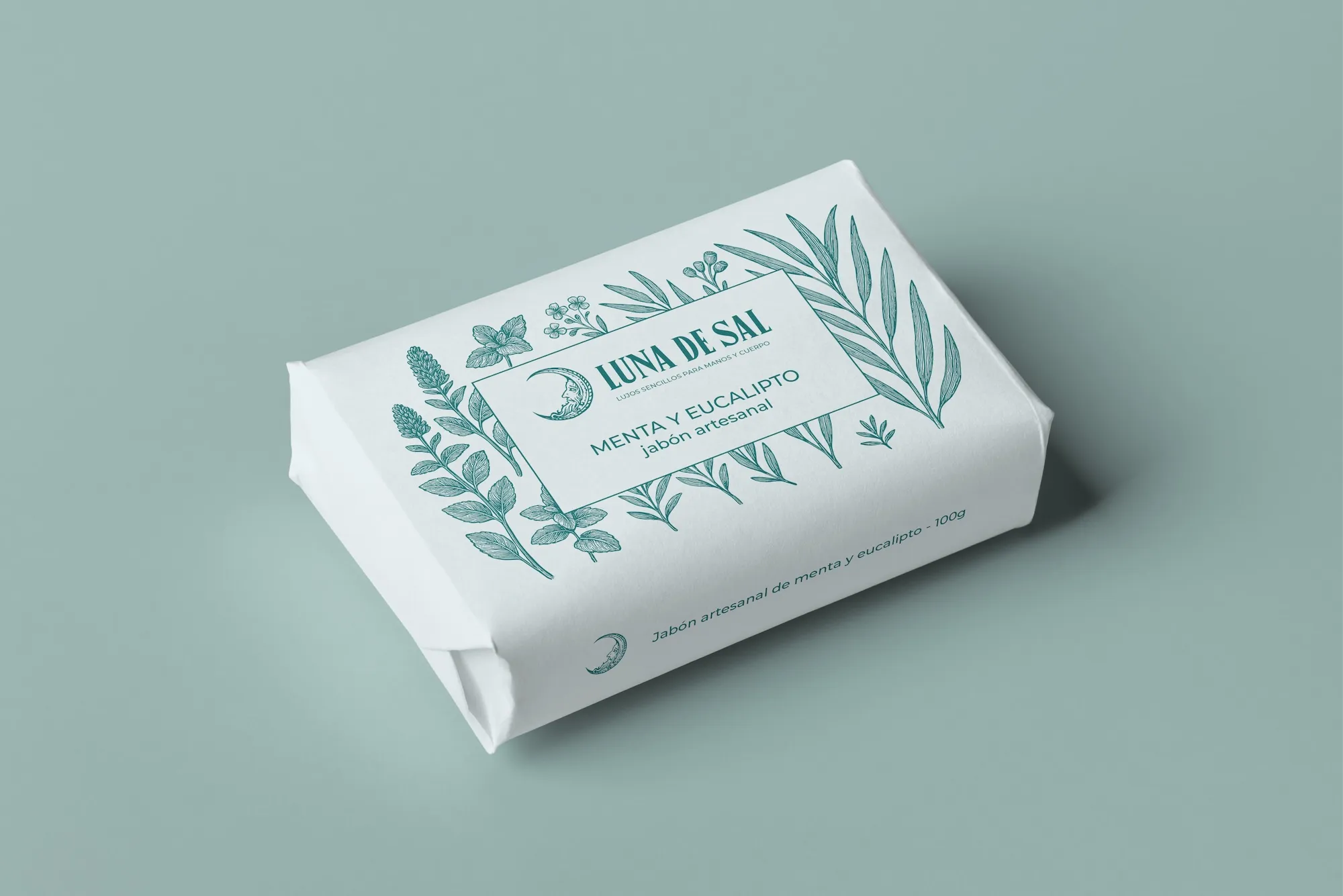
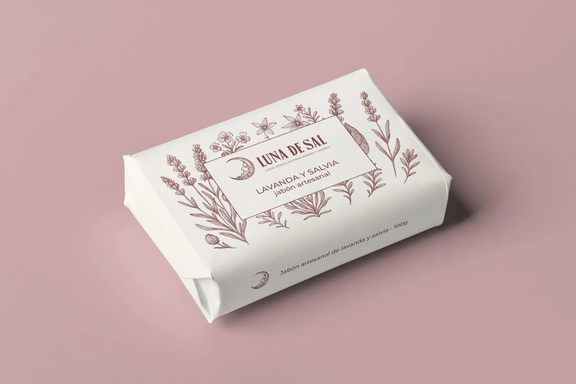
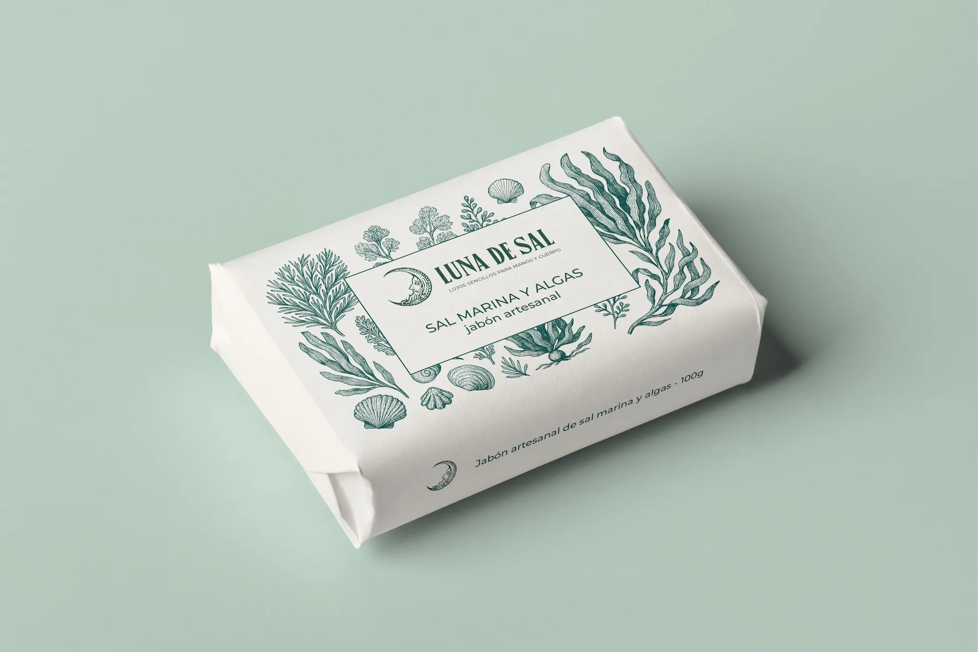
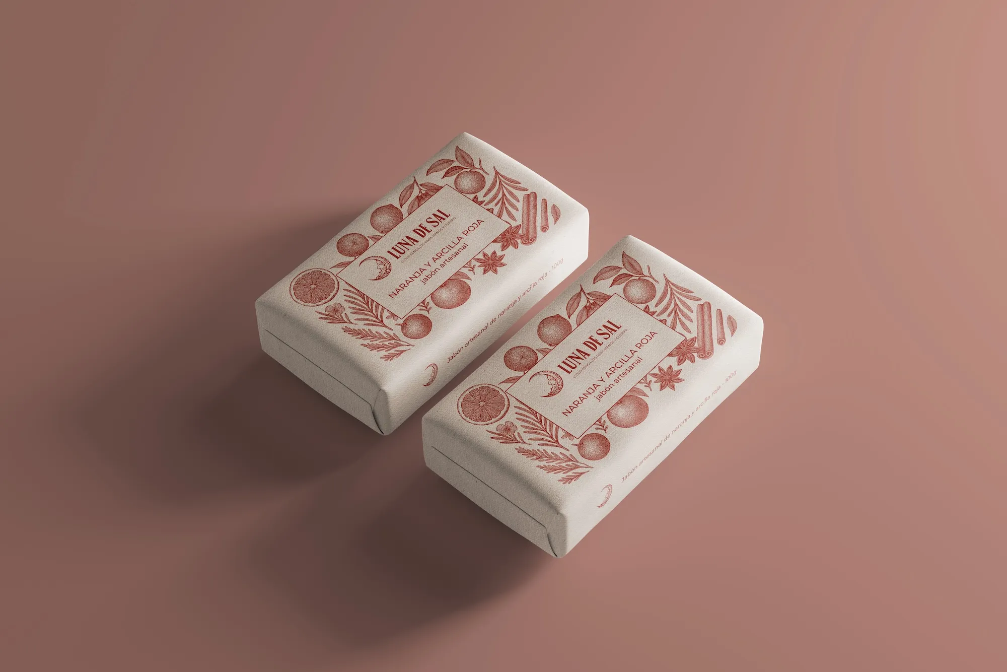
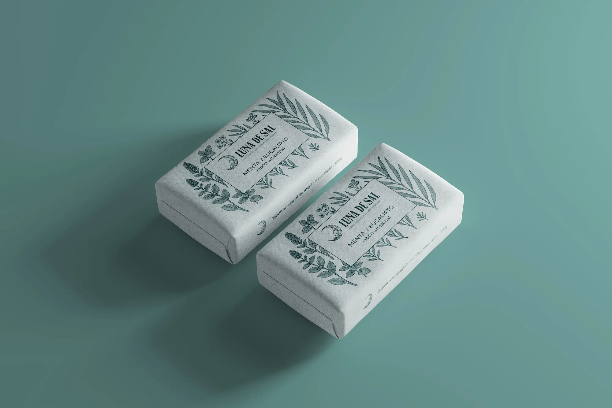
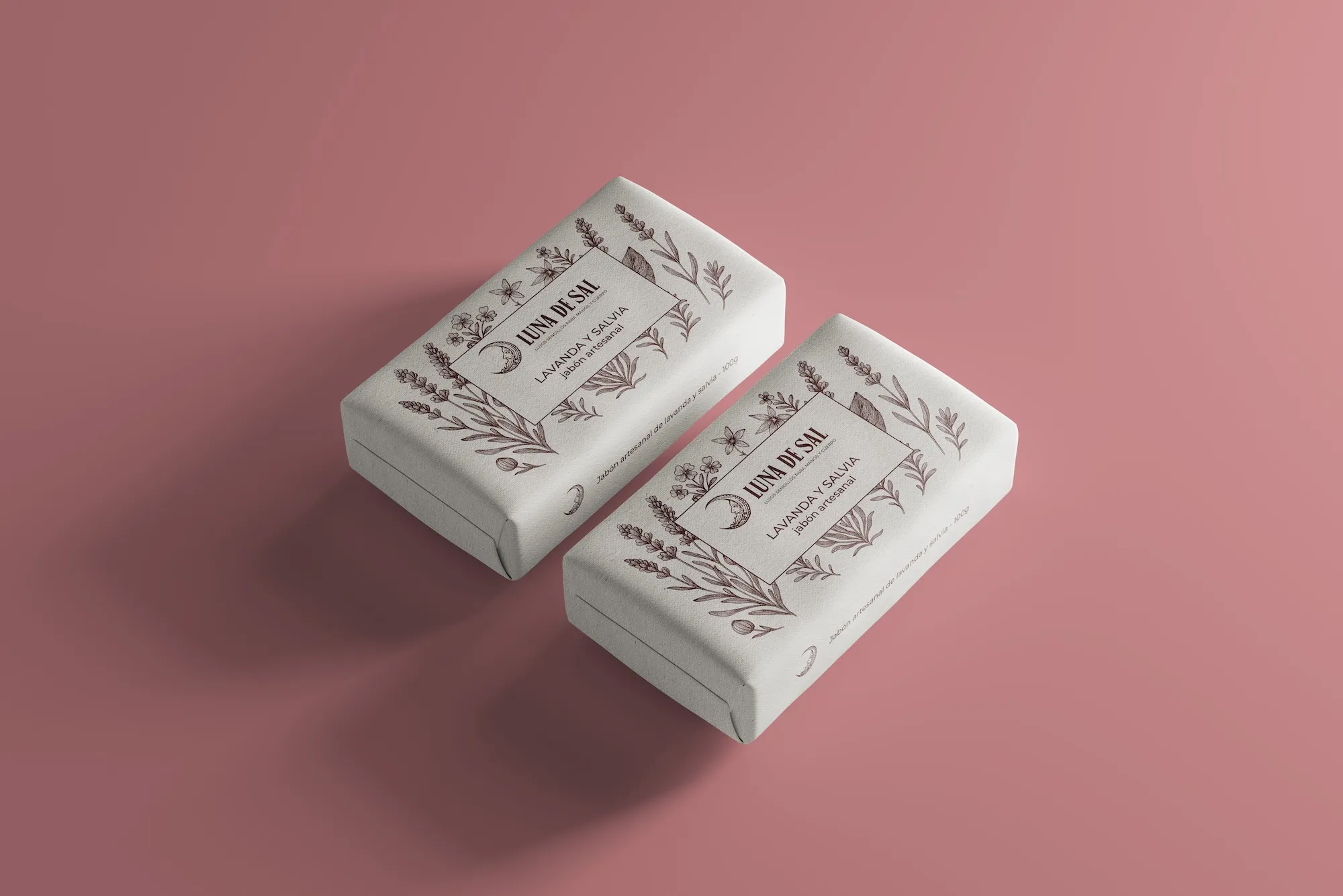
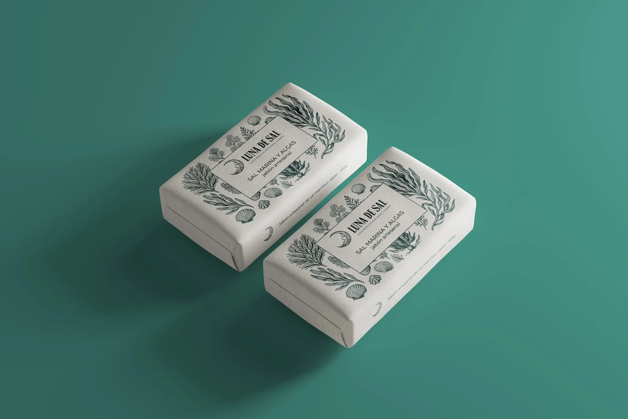
The identity design revolves around simplicity and detail. Botanical illustrations, drawn with care, bring an artisanal and organic tone that contrasts with a clean, contemporary structure. Each container is a small collectible piece, meant to be cared for, touched, and looked at with attention.
The colour palette brings together soft, textured tones that evoke old herbalist shops and natural light. Calm, well‑balanced typefaces accompany the logotype, where the name breathes with equal parts strength and delicacy.
More than a line of soaps or bath bombs, Luna de Sal is an invitation to pause. To give yourself a moment. To return to what is simple and honest, without giving up aesthetic pleasure.
A project that doesn’t shout, but endures. Like salt. Like the moon.